How to analyse time series results
A brand or insights lead watching a tracker move after a launch, price change, or repositioning needs one thing: proof that the decision caused the move, not just proof that the move is real. Wave-over-wave significance testing can only rule out noise; it cannot rule in your decision as the cause, because the tracker never observes what the metric would have done without it. Getting a real answer means treating the tracker's job (did the number move) and the causal job (did my decision move it) as two separate questions, answered with two different designs.
- A statistically significant wave-over-wave move only means the shift is unlikely to be sampling noise. It says nothing about what caused it.
- Panel conditioning (respondents changing their answers simply from repeated participation) is a built-in confound in every longitudinal tracker, not an edge case.
- Small subgroup cuts carry margins of error wide enough to manufacture "significant" moves out of nothing.
- A clean pre-trend in your tracking data does not validate that the trend would have continued unchanged without your decision.
- Attributing a shift to a specific action requires a designed comparison against the same population, before and after, not an annotated chart.
What does it mean to analyze time series results from a brand tracker?
In practice, "analyzing time series results" means three things done in sequence: plotting the tracked metric wave over wave, running a test against the margin of error to flag whether a shift is statistically distinguishable from noise, and segmenting by cohort, region, or subgroup to see where the shift concentrates. Most teams add a fourth step by habit: annotating the chart with whatever launch, price change, or competitor move happened nearby, and treating that proximity as the explanation.
That fourth step is where the analysis quietly stops being statistics and starts being narrative. The first three steps are legitimate description. They tell you a number moved and where. None of them tell you why.
The standard playbook, and where it stops
Longitudinal consumer research today runs almost entirely on repeated cross-sectional or panel surveys fielded at regular waves. Kantar alone maintains a brand-equity database spanning 21,000 brands across 540 categories in 55 markets (Kantar). The broader shift industry-wide has been toward "agile" continuous tracking with dashboards that auto-flag wave-over-wave movement the moment it clears the margin of error. Standard industry guidance calls for 300-400 respondents per wave for topline metrics, 600-1,000+ for subgroup cuts, and at least 12 periods before trusting a trend line.
What changed in that shift is automation, not the underlying logic. The design is still repeated observation of the same or similar population over time. It is not a controlled comparison against a counterfactual, and no amount of dashboard speed changes that.
Why doesn't a statistically significant move prove your decision caused it?
A significant move clears the noise bar, but clearing the noise bar is not the same as ruling out every other explanation for the shift. Attributing a tracked change to a specific cause requires something closer to the parallel-trends assumption used in difference-in-differences analysis: that absent your decision, the tracked group would have followed the same path as some comparison group or its own prior trend. That assumption combines restrictions on unobserved potential outcomes with restrictions on how the "treatment" (your decision) was assigned, which makes it non-standard and not directly verifiable from the observed data alone (NBER).
A clean historical trend line does not settle this. Parallel pre-trends in tracking data are neither necessary nor sufficient proof that the parallel-trends assumption will hold going forward, so a smooth chart before your decision does not validate a causal read of what happens after it (World Bank). You never observe the counterfactual path the tracked group would have taken without your action. Annotating the chart with "this is probably why" is a plausible story, not a proof.
The confound sitting inside every wave
Beyond the counterfactual problem, tracking studies carry a mechanical confound: repeated participation in the same longitudinal survey measurably changes how respondents answer in later waves, independent of any real underlying change. This panel conditioning effect is documented in the General Social Survey and holds across repeated-panel designs generally (NIH/PMC). A metric can drift purely because your panel has answered the same questions five times before, with no connection to your decision, your competitor, or the market at all.
How much noise hides inside a small subgroup cut?
A lot more than the "statistically significant" label on a dashboard suggests, and the gap is easiest to see in numbers rather than description.
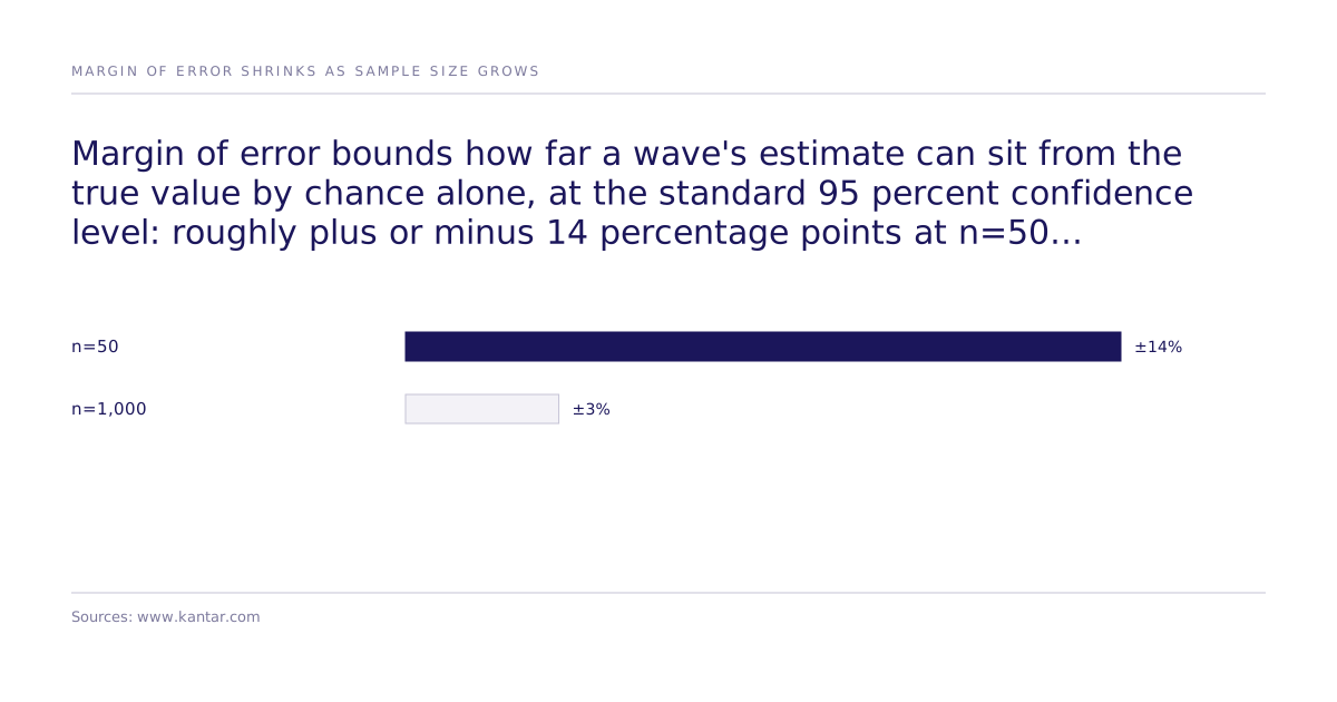
This is why subgroup cuts (the ones standard guidance says need 600-1,000+ respondents) are where trackers most often manufacture false positives: a topline sample built for ±3% precision gets sliced into a regional or cohort cut running closer to ±14%, and the dashboard applies the same significance flag to both (Kantar).
What a designed experiment adds that a tracker structurally cannot
A tracker tells you a number moved. Only a designed experiment, run against the same population before and after the decision, with the decision itself as the randomized intervention, can tell you whether your decision moved it. That is the difference between description and causal attribution: description asks whether the line changed; a designed experiment builds a holdout so you can compare what happened against what would have happened without the change, instead of inferring it from an annotated chart.
This is a design choice, not a bigger tracker. No amount of additional waves or tighter panel management turns a repeated observational survey into a randomized comparison. The intervention has to be built into the design from the start.
How this looks in practice
The mechanics: run a randomized experiment against a synthetic population built to mirror your market, analyzed with discrete choice models (McFadden discrete choice, Mixed Logit, ICLV) to estimate preference structure. DCE, Mixed Logit, and ICLV are estimators, not causal methods on their own. Causal identification comes from the randomized manipulation built into the experiment design.
The estimates from that design get validated against a human baseline. Our best configuration reaches 87% of the measured human ceiling on one study: 0.832 rank correlation against the published human result, where two independent samples of real humans reach 0.959. Across all 43 studies that pass design filters the mean is 0.73, per the causal fidelity paper. That number is a validation-set result, not a guarantee for a new market, and it comes with a caveat: some published human studies used for validation could exist in a model's training data, and the replication protocol is built to address that risk rather than pretend it away. Results across studies are tracked on a public leaderboard, and the broader method context sits in the methods and validation hub.
Tracker or designed experiment: which fits the decision in front of you?
The two designs answer different questions, and confusing them is the core mistake.
| Tracking study | Designed (randomized) experiment | |
|---|---|---|
| Question it answers | Did the metric move? | Did my decision move it? |
| Population design | Same or similar population observed repeatedly | Same population, randomized intervention applied, holdout compared |
| Main confounds | Panel conditioning, sampling drift, coincident events | Requires realistic population simulation, validated against a human baseline |
| What "significant" means | Move unlikely to be sampling noise | Effect attributable to the specific action tested, within a stated confidence interval for the simulated population |
| Best for: | Monitoring brand health over time, spotting when something needs investigating | Attributing a specific decision's effect before or after you make it |
Neither design replaces the other. The tracker's job is surveillance: flag that something is worth investigating. The experiment's job is attribution: determine which action drove the outcome, before you spend the budget or after you need to explain the result to the board.
What should a senior buyer do next?
Before your next wave closes, name the specific decision you want credit or blame for, and ask whether your current design can separate that decision's effect from panel conditioning, sampling drift in the relevant subgroup, and any coincident event on the calendar. If the honest answer is no, that's the signal to commission a designed experiment against the same population before the decision ships, not to add another annotation to the chart after it does. If you want to see how a randomized experiment against a synthetic population compares against your next tracker wave, talk to the team.