Nokia Rebrand — Old vs. New?
A brand leader deciding whether to greenlight a rebrand needs one thing from the Nokia story: proof, not anecdote, that the new mark changes what buyers actually do. Nokia's February 2023 redesign replaced its 60-year-old wordmark and Nokia Blue with a lighter, disconnected geometric mark from Lippincott, timed to Mobile World Congress and meant to signal a shift from "phone brand" to B2B network-technology company (It's Nice That). Design press largely endorsed the strategic logic; social media reaction was harsh and near-instantly compared the new mark to Kia's 2021 rebrand (Creative Bloq). Neither company ran a controlled test before shipping the new logo, so everything written about either rebrand since, including this article's own sources, is a description of what happened after the fact, not proof of what the logo caused.
- Nokia's old mark (Nokia Blue, block wordmark) is gone, replaced by lighter geometric letterforms from Lippincott, unveiled February 26, 2023 ahead of Mobile World Congress.
- Design critics praised the B2B repositioning logic; general social sentiment was hostile and drew immediate comparisons to Kia.
- Kia's 2021 rebrand is the reference case for "rebrand risk": a cited 27 percent brand-recognition drop and roughly 30,000 monthly searches for "KN car."
- Kia's later sales recovery is routinely used to argue the backlash didn't matter, but that recovery coincided with a new EV lineup and a market-wide rebound, so it doesn't isolate the logo's effect.
- The fix for both cases is the same: test the rebrand as a randomized choice experiment before it ships, not after.
What exactly changed in Nokia's 2023 rebrand?
Nokia retired its signature blue and the solid block wordmark it had used for roughly six decades, replacing them with thinner, disconnected geometric letterforms designed by Lippincott (It's Nice That). CEO Pekka Lundmark framed the change as a repositioning away from "phone brand" toward network infrastructure and B2B technology, timed to land just before Mobile World Congress. That framing matters for what comes next: the audience Nokia says it's rebranding for is enterprise buyers, not the people who post about logos on social media.
Why did people immediately compare it to Kia?
Because the visual language landed in the same territory: both moves swapped a heavy, literal wordmark for a lighter, more abstract geometric one, and viewers reached for the most recent comparable case they had. Creative Bloq documented the comparison directly, noting that social response was harsh even though the strategic rationale drew praise from critics (Creative Bloq). Transform magazine's assessment of the Lippincott work was similarly favorable on strategy, describing a considered rationale for the B2B shift even as public sentiment diverged sharply from critic sentiment (Transform). The split itself is the tell: design press and the general public were evaluating different things, one on strategic fit, the other on gut reaction to a familiar shape changing.
Kia's rebrand: the number behind the comparison
Kia's 2021 logo change is the case everyone reaches for, and it comes with real numbers attached. Verasight survey data attributed a 27 percent drop in brand recognition to the redesign (Verasight). The new mark was widely misread as "KN," generating roughly 30,000 monthly Google searches for "KN car" (SlashGear). Those are observational numbers, a survey and a search-volume count taken after the fact, and they measure confusion, not whether the logo itself changed anyone's purchase decision.
Did Kia's later sales recovery prove the logo didn't hurt it?
No. Kia's sales grew after 2021, but that growth arrived alongside a new EV lineup and a broader auto-market recovery, so crediting (or clearing) the logo for it is a correlation error, not a finding. This is the exact shape of the problem that makes rebrand case studies hard to reason about from prose alone: three separate causes moved at once, and only one outcome, sales, was observed.
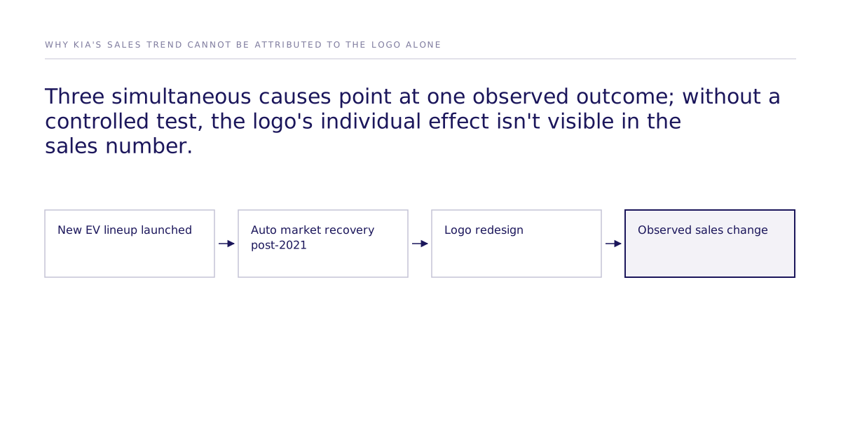
The standard version of this story, both for Kia and now for Nokia, treats "the backlash faded" as evidence the rebrand worked. It's closer to a null result: nobody measured the logo's isolated effect at all, which means the claim that it didn't matter is unproven, not disproven.
Live-market reaction vs. a controlled choice test
The two approaches to answering "did the rebrand work" produce different evidence, on different timelines, from different populations.
| Live-market reaction | Controlled choice test | |
|---|---|---|
| What it measures | Social sentiment, press coverage, and sales after launch | Buyer choices between rebrand variants, isolated from confounds |
| When you get the answer | Weeks to months after the logo ships, once it's expensive to reverse | Before launch, while the design is still changeable |
| Who it captures | Whoever chooses to post, typically the most vocal critics | A sample constructed to match the target buyer, such as enterprise network-technology purchasers |
| Confound risk | High: sentiment and sales move with unrelated events like new product launches or market cycles | Low: the manipulation is randomized, so other causes are held constant |
| Best for | Confirming a launch happened and gauging general noise | Deciding, before spending on the launch, whether the specific brand change moves the buyer's actual choice |
Why isn't social sentiment the buyer Nokia is targeting?
Because a Twitter reply and a B2B procurement decision are made by different people, on different timelines, for different reasons. Nokia's stated goal was enterprise recall and consideration among network-technology buyers, not favorable sentiment among consumer phone users who remember the old brand. Stated social reaction is also a self-selected sample: the people motivated to post are disproportionately the ones with the strongest (usually negative) reaction, not a representative slice of the buying population. Treating that sample as market feedback measures noise, not the effect the rebrand was actually meant to produce.
How do you test a rebrand before it ships?
Run a randomized experiment where buyers choose between logo and positioning variants under controlled conditions, then analyze the choices with discrete choice models, McFadden's foundational logit, Mixed Logit, or ICLV, rather than reading sentiment after the fact. The causal identification comes from the randomization in the experiment design, not from the estimator; McFadden's model, Mixed Logit, and ICLV are ways to recover preferences and effect sizes from those randomized choices, not causal methods on their own. Mixed Logit is worth naming specifically because it relaxes the independence-of-irrelevant-alternatives (IIA) assumption that a flat logit imposes, which matters when a rebrand test includes several design variants a buyer might substitute between rather than a single up-or-down choice.
This is the same logic behind Subconscious's validation work: a study replicated on a simulated population is checked against the original human study's direction and outcome. Our best configuration reaches 87% of the measured human ceiling on one study: 0.832 rank correlation against the published human result, where two independent samples of real humans reach 0.959. Across all 43 studies that pass design filters the mean is 0.73 (the causal fidelity paper). That figure is a validation-set result, not a guarantee for a new market or a new rebrand, and it comes with a standing caveat: some published human studies used for validation may overlap with a model's training data, which is why the replication protocol exists rather than treating held-out comparisons as a clean guarantee. The leaderboard publishes those replication results so buyers can check the method's track record before trusting it with their own decision, and the methods and validation hub covers how the discrete choice models above are applied and checked.
What should a buyer do before the next rebrand?
Write the choice test before the design is final, not after the launch generates headlines. Decide which two or three logo and positioning variants are actually on the table, define the buyer population the rebrand is meant to move (Nokia's case: enterprise network-technology purchasers, not consumer phone users), and run a randomized choice experiment across those variants before any of them ship. If a rebrand decision is on your desk now, that test is the concrete next step, not another round of reading social sentiment or comparable case studies. More rebrand and positioning decisions like this one are broken down in case studies. If it would help to think through the specific variants worth testing, get in touch.