Radar Plots Must Die
Radar charts must die because a polygon's area encodes arbitrary choices like spoke order and angular spacing, so a linear bar or distribution chart on a shared axis reports the underlying percentiles more directly. A radar chart draws each of several independent metrics as a spoke and closes the points into a polygon. It compresses many numbers into one memorable shape, which is why it shows up whenever a team hands multi-attribute results to an executive: a causal experiment with several attributes, claims, or segments tested at once. The problem: the shape a reader perceives depends more on the analyst's arbitrary choices, spoke order, angular spacing, than on the numbers themselves.
For a buyer reporting causal effects across several attributes, the choice comes down to two chart families: a compressed polygon, or a linear, order-independent encoding such as bars or distributions on a shared scale. This isn't cosmetic. A polygon can amplify or suppress an effect purely through chart geometry, not the underlying estimate, and a leadership team can greenlight a claim, a price, or an audience based on a distorted read rather than the causal result.
What does the polygon actually encode?
A radar plot maps metric values or percentiles to radii and joins them into a polygon. The area is a function of those values and their ordering; it is not automatically a meaningful aggregate score for the underlying measurements.
Two problems compound:
- Spoke order carries no inherent meaning. Independent metrics don't come with a built-in sequence, yet a radar is inherently spatial, and spatial layouts push readers toward spatial inference: two adjacent spokes read as related, even though that proximity is only a layout choice.
- The radial encoding distorts magnitude through the polygon's own geometry. The radial axis encodes each percentile linearly, so an 80th-percentile spoke runs twice as long as a 40th-percentile spoke. But the polygon's area, what a reader actually perceives, follows a different rule.
For a polygon with n spokes at equal angular steps:
A = (1/2) * sin(2π/n) * Σ(r_i * r_(i+1))
Where: A = polygon area, n = number of spokes, r_i = the length (percentile value) of spoke i
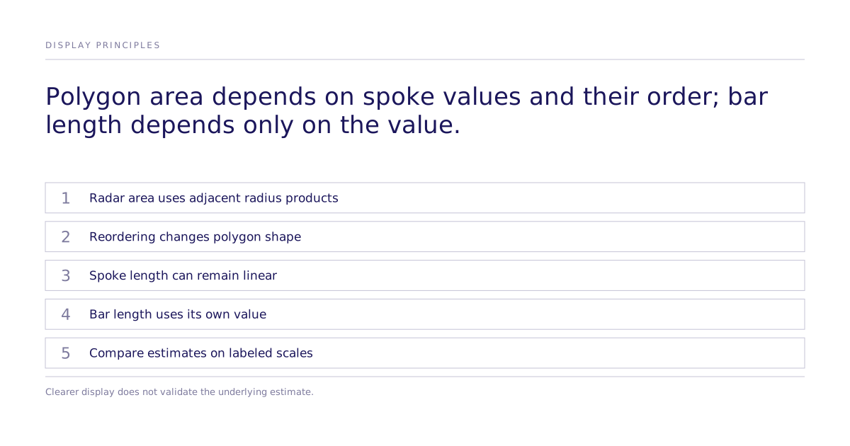
Adjacent radius products determine polygon area. Christopher Fonnesbeck’s May 2026 PyMC Labs article gives an Iker Muniain example in which the xG spoke’s area share is suppressed by 11.6 percentage points through its neighbors, despite a percentile close to progressive passing. That is a worked sports-visualization example, not Subconscious performance evidence.
A third cost stacks on top: comparing two non-adjacent spokes requires mentally rotating one value onto the other before judging which is larger, and that gets more expensive as the spokes sit farther apart on the wheel.
Why linear position beats angle and area
Polar coordinates can be appropriate when angle has a meaningful interpretation, such as direction in a wind rose or time of day in a clock-face plot. The radial distance then encodes another specified quantity. Arbitrarily ordering unrelated metrics around a circle provides a different structure.
A shared quantitative scale permits direct comparison of position and bar length without rotating separate axes. Cleveland and McGill’s graphical-perception paper is background on evaluating quantitative encodings. Label the units and baseline rather than assuming every visual comparison is equally clear.
In a percentile bar strip, each metric has a labeled row and bar on a common scale. Reordering rows does not change bar length. With a zero baseline and linear encoding, a 90th-percentile bar is twice the length of a 45th-percentile bar. Polygon area instead depends on adjacent radius products.
| Failure mode | Radar polygon | Percentile bar strip |
|---|---|---|
| Depends on spoke/row order | Yes, area term binds each value to its neighbors | No, each row is an independent `(label, length)` pair |
| Area represents individual magnitude linearly | No, polygon area uses products of adjacent radii; spoke length itself can be linear | Bar length can be linear on a common zero baseline |
| Comparing two non-adjacent items | Requires mental rotation around the wheel | Direct vertical read, same effort as neighboring rows |
The same test explains why other visualizations hold up: shot charts, where the 2D space is the physical court, so coordinates don't need reordering, and area deliberately encodes density rather than emerging incidentally from a closed shape; heatmaps, where rink or field coordinates are the chart's real space. The rule: a chart's axes have to mean something real. Field coordinates and literal physical quantities work. An arbitrary angular assignment connected into a polygon does not.
How do you read grouped estimates without losing distribution?
A bar strip displays one value per metric. A ridge layout can additionally show the peer distribution of each underlying metric and mark the focal value. Label each metric’s scale and units: percentile rank alone does not show the raw-value gap or distribution. Grouping related metrics does not validate the estimates or create a common unit where none exists.
Where does this apply beyond sports analytics?
The same display issue applies when reporting several estimated effects. Show each on a shared scale, with uncertainty when available, and name the endpoint: modeled choice, human stated choice, or actual behavior. Display geometry should not imply a larger effect or realized conversion that the study did not measure.
This is a data-visualization design principle, not a Subconscious product or shipped feature. The specific case above, and its 11.6-percentage-point distortion, comes from sports-analytics data and generalizes as a chart-design argument. Applying it to causal effect estimates means keeping the display linear and order-independent; it does not mean the underlying experiment design or effect estimates changed. How a result is estimated and how it is displayed are separate problems, and treating a distorted chart as new evidence about the underlying effect is exactly the mistake this argument is against.
The practical takeaway for reporting causal results
Before reporting several estimates, check whether their display changes with arbitrary ordering, whether adjacent values alter polygon area, and whether readers can compare values on meaningful scales. A radar’s radial lengths can remain linear even when its polygon area changes. Bars or intervals on labeled common scales avoid that adjacency term; they do not validate the underlying estimates. Review the study method separately.
Limitations
Keep the sports example separate from evidence about a model or study. Display estimates on meaningful scales and show supported uncertainty. A clearer chart does not change the underlying identification, measurement, or validation.